INDUSTRY:
TECH & DESIGN
CLIENT:
AUTODESK
YEAR:
2023
EXPERIENCE:
UX DESIGN
Autodesk, Inc. is a globally renowned leader in software solutions for the architecture, engineering, construction, manufacturing, media, and entertainment industries.
Challenge
The panel component already existed in the Autodesk design system, but some product teams were implementing their own versions. This indicated a gap between the actual needs of the teams and what the design system was providing. The challenge was to create a panel component that could be implemented across all products.
Goal
Integrate the Data Grid component from the MUI library cohesively into the existing design system, creating guidelines and designs to assist developers in adapting this component. In other words, Weave-ifying MUI data grid features.
My Role
I was the Product Designer responsible for this component, under the guidance of the Lead Designer.
My Responsabilities
I worked on research, sketches, prototypes, and guidelines creation.
design process
The design process to create a new component follows: research, sketches, design, and documentation.
Research
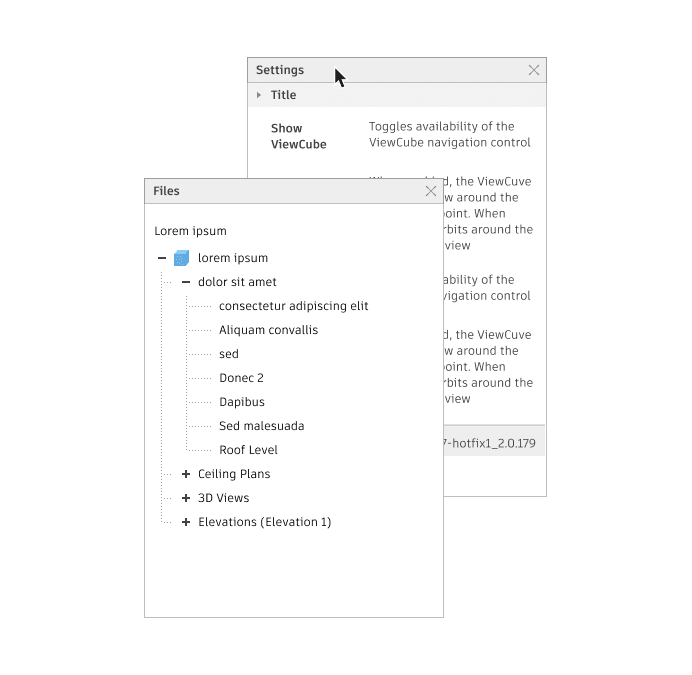
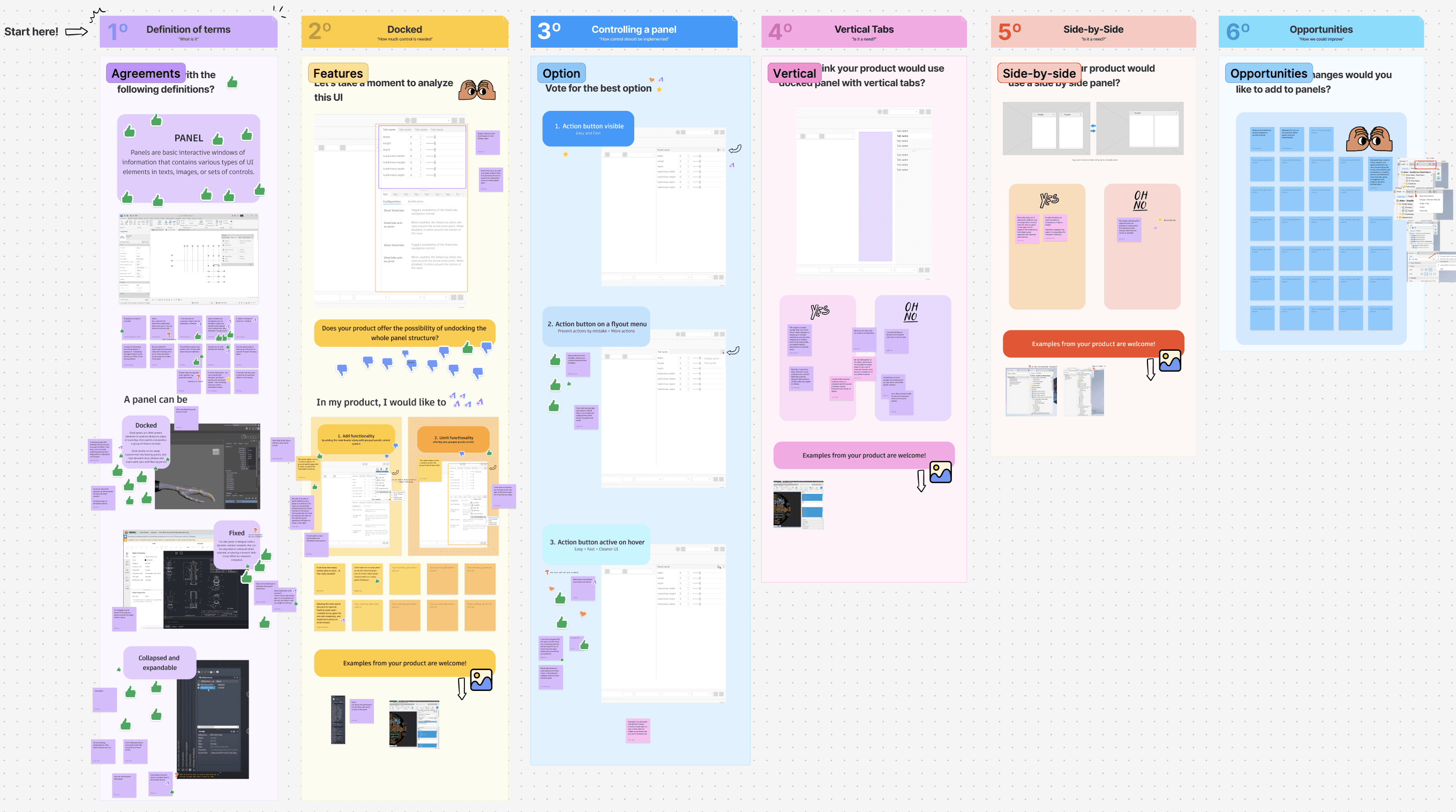
Since the component existed but was not widely used, research focused on understanding the product teams' needs regarding panels. I contacted designers across Autodesk, collecting numerous panel examples. Products were customizing panels due to space issues, lack of guidance, and specific UI needs. To address this, I hosted a Zoom workshop with designers to integrate their needs into one component, defining panel characteristics, behaviors, and differences from modals. We discussed specific panel behaviors required and allowed for additional suggestions. An external audit of panel implementations in products like Adobe and Sketch was conducted to understand expected behaviors.
Design
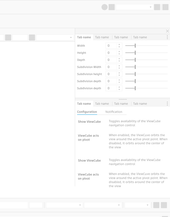
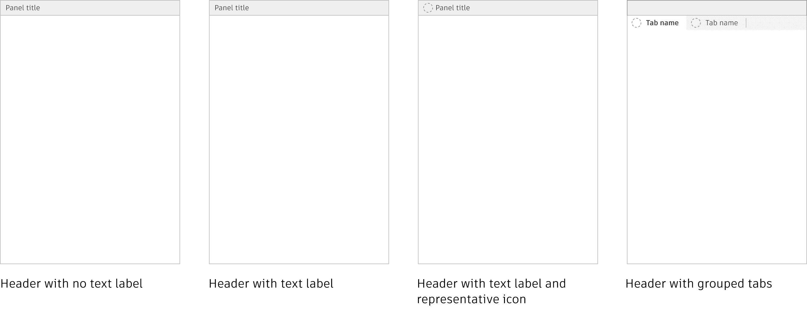
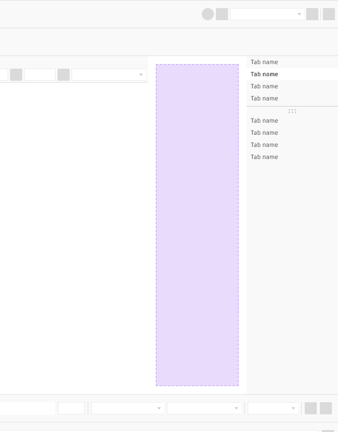
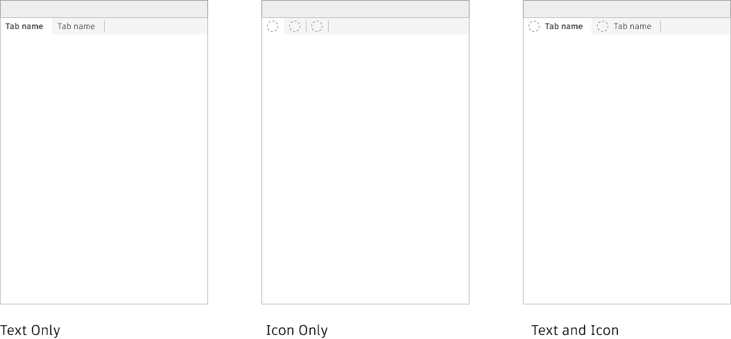
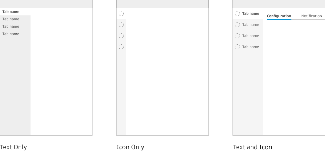
For the design specifications, we focused on panel behaviors. After the workshop and research, I began designing prototypes based on our conclusions. We determined that a panel could be docked, floated, or fixed, and it could be collapsible and expandable, unlike modals. It was also evident that the product teams needed vertical tabs, so I provided designs to meet this need.
Documentation
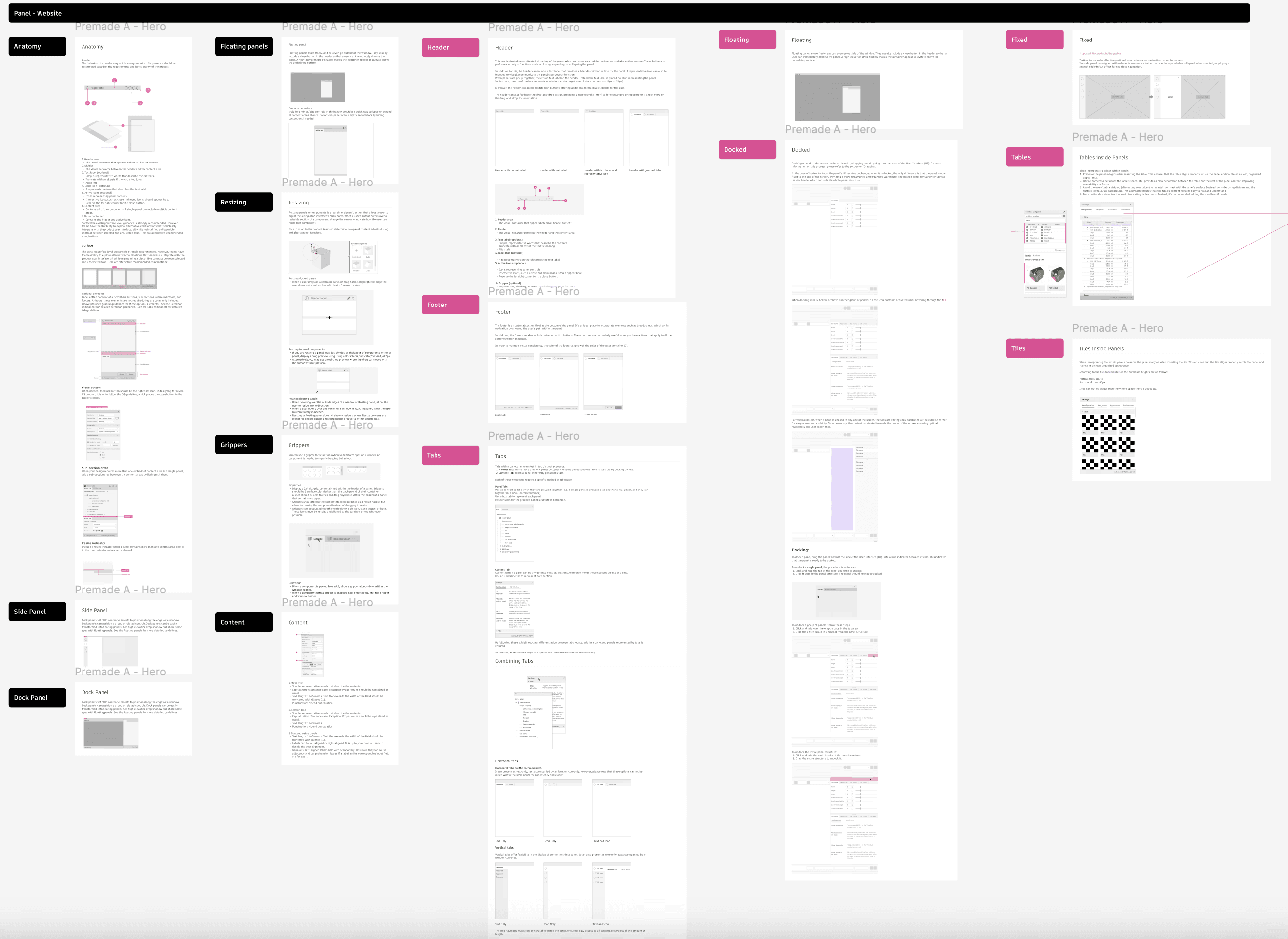
After the design phase and discussions with the design system team, I started writing the documentation based on the workshop results, designs, and discussions. I received constant feedback and opinions from designers across Weave and product teams.
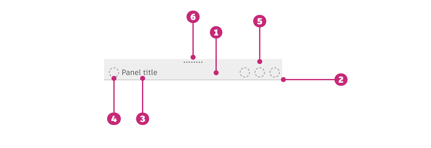
On the documentation we focused on the anatomy, tabs within panels and the behaviors, specifically docking experience
Implementation
Currently in progress
results
We successfully delivered a component to our design system and multiple product teams, created full and detailed documentation of every feature both in Figma and on the website.