INDUSTRY:
TECH & DESIGN
CLIENT:
AUTODESK
YEAR:
2024
EXPERIENCE:
UX DESIGN
Data Grid
Data Grid
about.
about.
Autodesk, Inc. is a globally renowned leader in software solutions for the architecture, engineering, construction, manufacturing, media, and entertainment industries. Weave is Autodesk's design system, providing a framework of reusable components, guidelines, and best practices to ensure consistency and efficiency across all Autodesk products.
Challenge
We decided to transition our Design System using the MUI library. New components needed to be introduced to Weave, specifically the data grid. Our design team at Weave had to transform this component to align with the existing Design System, detailing its functionality so both developers and design teams at Autodesk could utilize it effectively.
Goal
Integrate the Data Grid component from the MUI library cohesively into the existing design system, creating guidelines and designs to assist developers in adapting this component. In other words, Weave-ifying MUI data grid features.
My Role
I was the Product Designer, working closely with two other Product Designers, a Product Manager, and the Developers team.
My Responsabilities
I worked on the discovery process, research, sketches, prototypes, guidelines creation, developer assistance, QA, and documentation updates. Specifically for the features: Row grouping and selection, Master Detail, Empty State, Pagination, Sorting and Multi-sorting, Resizing and Scrolling
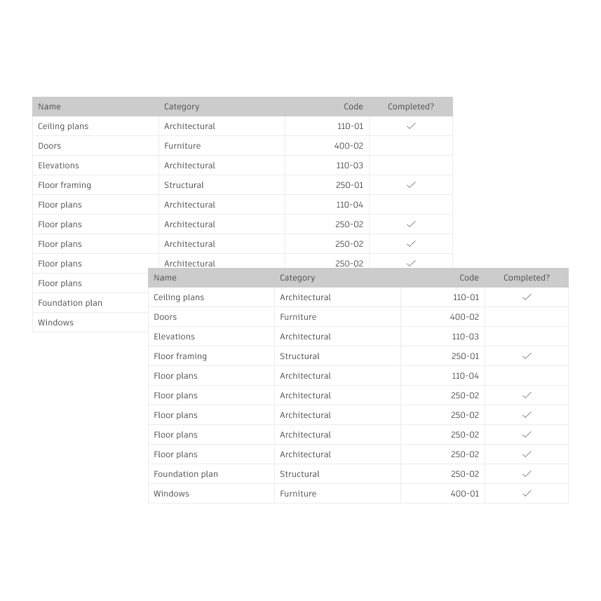
Row
A horizontal group of content within a table. It can contain multiple types of data.
Row aNATOMY
Drag handle (optional): An interactive icon that indicates the row is draggable. Persistently visible if a row is draggable.
Check box (optional): Allows users to select or deselect the row. Users can select a row by clicking directly on the check box, clicking on the row itself, or both.
Cell: The smallest unit within the table; it is the intersection point of a column and a row.
Action button (optional): An interactive icon button that performs an action on the entire row. Use up to three action buttons per row. If you have more than three, use an icon button with an ellipsis icon and a popover menu instead.

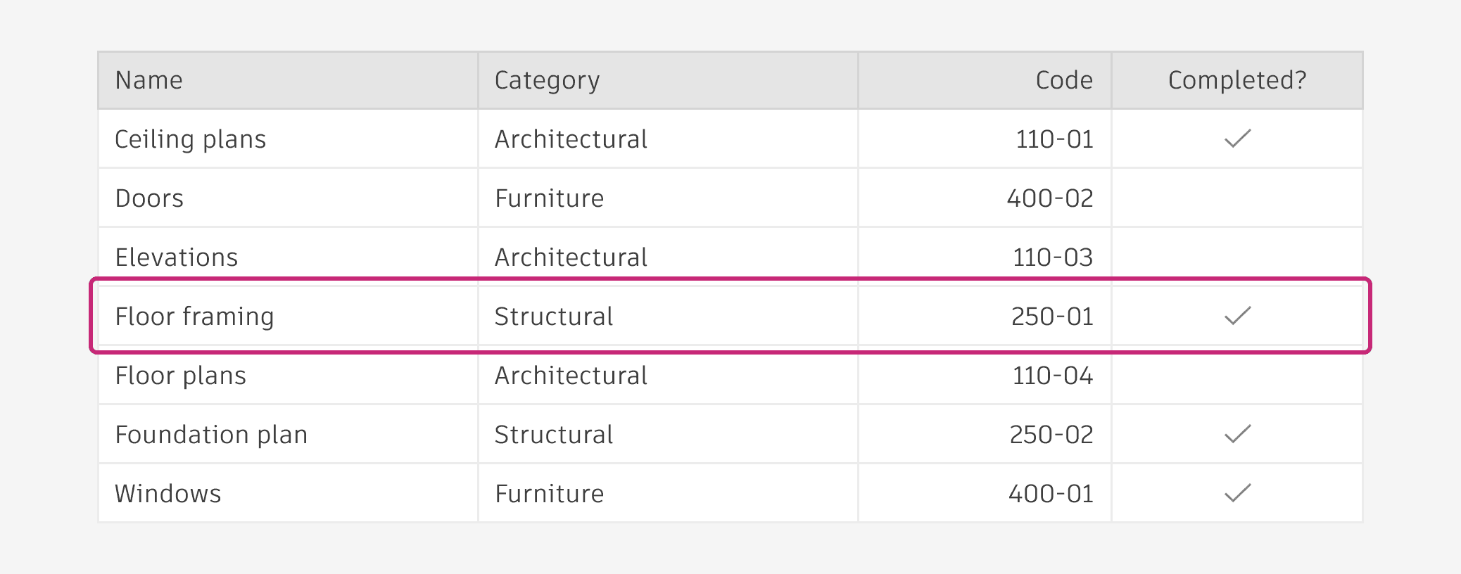
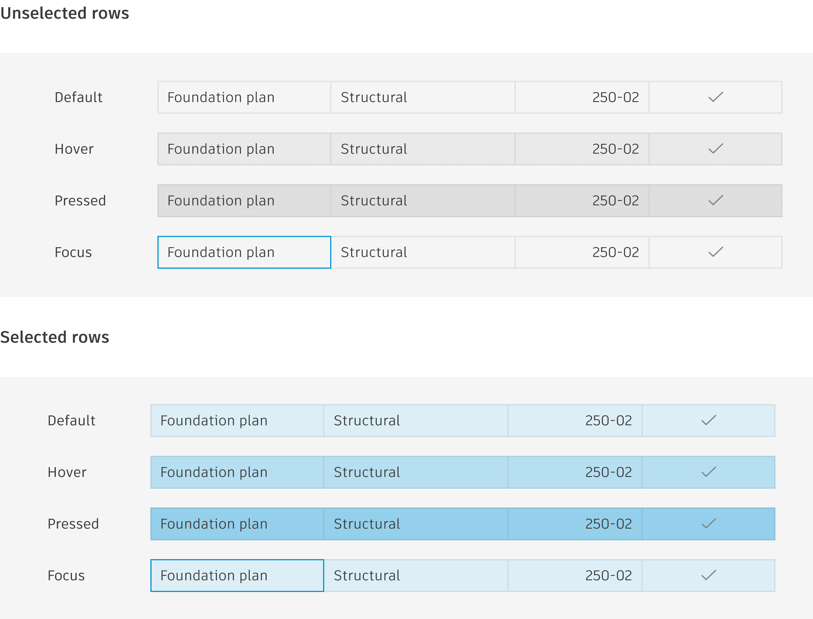
Row states
Rows can have different states depending on user interaction.
Row selection allows the user to select and highlight a single or multiple rows that they can then take action on.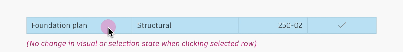
MASTER DETAIL
The master detail feature allows the expansion a row to display additional information inside a panel. Use the operator controls,+ (plus) and - (minus), to show or hide the master detail of an item.
When scrolling horizontally, only the rows are moved, keeping the master detail centered in the viewport. It is also recommended to keep the operator control column pinned.

Row grouping
Organize your data by categorizing rows based on specific column values. It's possible to have groups inside groups and also second level groups.
To open or close row groups, users must click on the caret icon specifically.

Row
A horizontal group of content within a table. It can contain multiple types of data.
Row aNATOMY
Drag handle (optional): An interactive icon that indicates the row is draggable. Persistently visible if a row is draggable.
Check box (optional): Allows users to select or deselect the row. Users can select a row by clicking directly on the check box, clicking on the row itself, or both.
Cell: The smallest unit within the table; it is the intersection point of a column and a row.
Action button (optional): An interactive icon button that performs an action on the entire row. Use up to three action buttons per row. If you have more than three, use an icon button with an ellipsis icon and a popover menu instead.
Row states
Rows can have different states depending on user interaction.
Row selection allows the user to select and highlight a single or multiple rows that they can then take action on.MASTER DETAIL
The master detail feature allows the expansion a row to display additional information inside a panel. Use the operator controls,+ (plus) and - (minus), to show or hide the master detail of an item.
When scrolling horizontally, only the rows are moved, keeping the master detail centered in the viewport. It is also recommended to keep the operator control column pinned.
Row grouping
Organize your data by categorizing rows based on specific column values. It's possible to have groups inside groups and also second level groups.
To open or close row groups, users must click on the caret icon specifically.
design process.
The Data Grid has numerous functionalities, such as Filtering, Ordering, Grouping, Master details, and more. As this was a high-priority story, we worked as a team to move as effectively as possible. The first step was to understand the behavior of the feature I was redesigning through research and discovery. We were not only redesigning but also creating detailed guidelines for use and behavior. Weave already had a design for tables, so we implemented the MUI features into it.
Some issues would cross our ways, for example, in some data grid functionalities, MUI uses the header cell as a button to activate them. However, when predicting usage scenarios, we noticed that two functionalities using this target area could coexist: reordering (which allows reordering content by alphabetical order) and column selection (which allows selecting the entire column by clicking the header cell). To resolve this conflict, we studied case studies of data grid usage within Autodesk products to find a solution. In this case, we enabled the header cell to select the row and kept the reordering feature as an action button on the header, which were made visible when hovering through the header cell.
Sorting
Sort your rows based on one or several criteria.
Sort by Column header cell:
Upon hover, every unsorted column header cell displays an upward-pointing arrow. Clicking on the icon button will automatically perform the next sort function, in the following order:Sort by ascending (ASC)
Sort by descending (DESC)
Unsort

Sorting behavior
Overflow menu (bellow)
Upon hover, column headers reveal the More menu, and users can click the desired Sort function. The column header cell then displays the appropriate arrow (or the absence of an arrow, in the case of unsort).
multiSorting
Users can sort table data according to multiple criteria at once by holding down the Ctrl or Shift keys while clicking column headers. The order in which the columns are selected defines the sorting priority, and a number indicating the sort order will appear in each column.
Clicking on a sorting button without holding down the Ctrl or Shift keys removes sorting from all columns.
Clicking on a sorted column within a multi-sorting sequence reverses the sorting direction of that column, and removes the multi-sorting sequence, leaving only the sorting of the newly selected column in effect.

Sorting
Sort your rows based on one or several criteria.
Sort by Column header cell:
Upon hover, every unsorted column header cell displays an upward-pointing arrow. Clicking on the icon button will automatically perform the next sort function, in the following order:Sort by ascending (ASC)
Sort by descending (DESC)
Unsort
Sorting behavior
Overflow menu (bellow)
Upon hover, column headers reveal the More menu, and users can click the desired Sort function. The column header cell then displays the appropriate arrow (or the absence of an arrow, in the case of unsort).multiSorting
Users can sort table data according to multiple criteria at once by holding down the Ctrl or Shift keys while clicking column headers. The order in which the columns are selected defines the sorting priority, and a number indicating the sort order will appear in each column.
Clicking on a sorting button without holding down the Ctrl or Shift keys removes sorting from all columns.
Clicking on a sorted column within a multi-sorting sequence reverses the sorting direction of that column, and removes the multi-sorting sequence, leaving only the sorting of the newly selected column in effect.
Design and Documentation:
I was responsible for studying the MUI documentation of a feature, then working in Figma to create a Weave design that translated that feature and aligned with the design team. For documentation, we focused on Anatomy, Behavior, and Best Practices. Since this documentation would also assist developers in building the components, we created high-fidelity prototypes to complete the documentation, showing exactly what the expected behavior should be.
pagination
Located in a footer, the pagination feature consists of a bar where users can navigate between pages using "next" and "previous" arrows, and page numbers.

pagination anatomy
Footer: The footer houses the pagination options
Row per page selector: A dropdown allows selection of the number of rows visible per page. Typically, options are 25, 50, and 100 for desktop, but it can be adjusted to meet your requirements. The dropdown should always use the line variant.
Pagination indicator: Indicates the rows being displayed, and the total number of available rows.
Row group navigator: Arrows used to navigate through the group of rows.
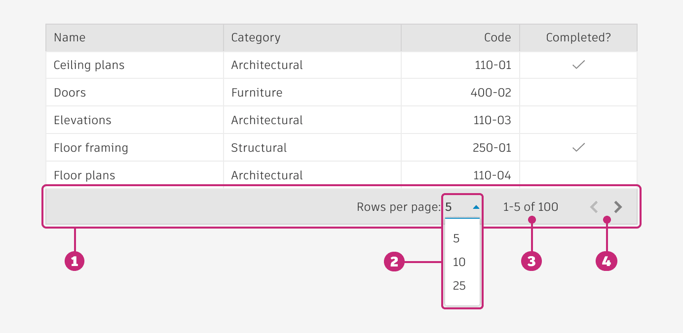
pagination behavior
When clickin on the number input, a dropdown menu appears, from which the user can select the number of rows to be displayed per view.
If the table has a fixed height, and the height of the selected number of rows per page is greater than the fixed height, the user must scroll down to view the full content. The scrollbar will appear in the top-right corner of the table, below the header, and will move as far as the bottom right corner upon scrolling.
The left/right arrows that allow users to navigate between pages, will be shown as default only if there are more results. If there are no results available in those directions they will show disabled.

pagination
Located in a footer, the pagination feature consists of a bar where users can navigate between pages using "next" and "previous" arrows, and page numbers.
pagination anatomy
Footer: The footer houses the pagination options
Row per page selector: A dropdown allows selection of the number of rows visible per page. Typically, options are 25, 50, and 100 for desktop, but it can be adjusted to meet your requirements. The dropdown should always use the line variant.
Pagination indicator: Indicates the rows being displayed, and the total number of available rows.
Row group navigator: Arrows used to navigate through the group of rows.
pagination behavior
When clickin on the number input, a dropdown menu appears, from which the user can select the number of rows to be displayed per view.
If the table has a fixed height, and the height of the selected number of rows per page is greater than the fixed height, the user must scroll down to view the full content. The scrollbar will appear in the top-right corner of the table, below the header, and will move as far as the bottom right corner upon scrolling.
The left/right arrows that allow users to navigate between pages, will be shown as default only if there are more results. If there are no results available in those directions they will show disabled.
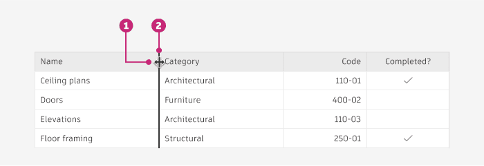
RESIZING
Columns of a table can be resized based on user needs, by hovering over the column divider lines.
BehaviorWhen resizing a column, the column changes size in real time.
Other columns within the table respond to the one being resized by shifting over; they do not change size.
Columns have a minimum width of 50px.

RESIZING aNATOMY
Resize cursor: When a user’s cursor hovers over the border between columns, change to indicate the ability to resize.
Divider: When the user clicks and drags on a column, the divider thickness increases to 2px, and adopts a relevant surface pressed state. Table columns resize in real time, allowing users to see what exactly is being resized. When the user lets go of their dragged row, apply the transformation.
Scrolling
The scrolling component allows smooth and efficient navigation through content that exceeds the visible area of a container. This component is essential for applications dealing with large datasets, long lists, or extensive text content, ensuring that users can easily access all available information without overwhelming the interface.
Scrolling aNATOMY
Scrollbar: Always appears within the borders of the table . Can be placed vertically on the right side of the table, and/or horizontally on the bottom of the table. Use padding to ensure there’s adequate space around the scrollbar, to prevent content within the table from being covered or shifted.
Scrollbar area: Space in which the scrollbar moves.
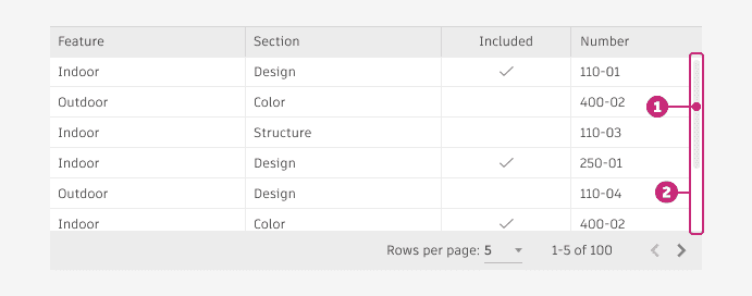
Scrolling behavior
When scrolling vertically, make sure the header of the table and the pagination bar (if included) remains fixed.
When scrolling horizontally, the header scrolls along with the content, but the pagination bar (if included) remains fixed.


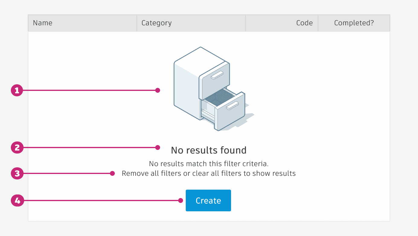
empty state
Empty states within tables display a message to the user when data is not available.
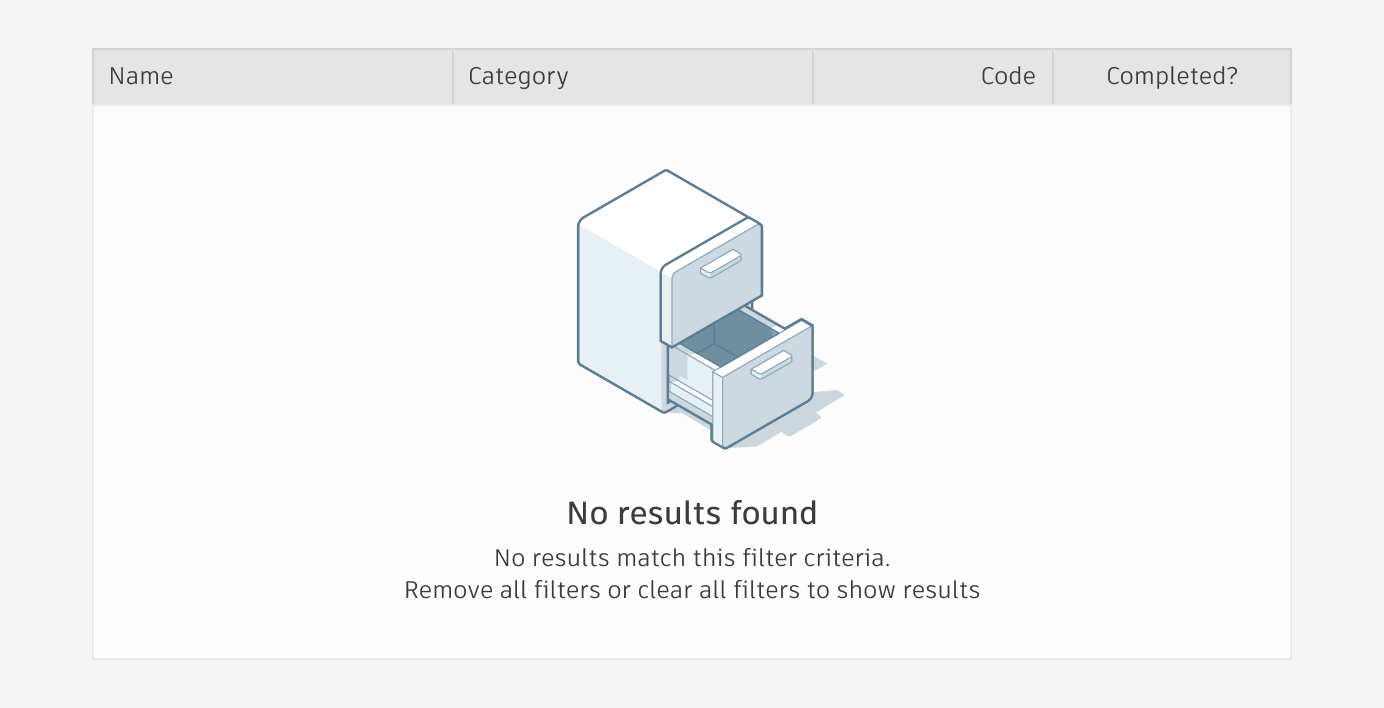
empty state aNATOMY
Non-interactive Illustration (optional based on available screen real estate): Include an illustration that conveys your industry (e.g. film & production, manufacturing, etc). The maximum height is 150px.
Missing item: Set expectations for what should be displayed in the location.
How to statement: Provide information about how to add items to the location.
Call to action (Optional): Include a button or text link that prompts users to resolve the empty state issue.
RESIZING
Columns of a table can be resized based on user needs, by hovering over the column divider lines.
BehaviorWhen resizing a column, the column changes size in real time.
Other columns within the table respond to the one being resized by shifting over; they do not change size.
Columns have a minimum width of 50px.
RESIZING aNATOMY
Resize cursor: When a user’s cursor hovers over the border between columns, change to indicate the ability to resize.
Divider: When the user clicks and drags on a column, the divider thickness increases to 2px, and adopts a relevant surface pressed state. Table columns resize in real time, allowing users to see what exactly is being resized. When the user lets go of their dragged row, apply the transformation.
Scrolling
The scrolling component allows smooth and efficient navigation through content that exceeds the visible area of a container. This component is essential for applications dealing with large datasets, long lists, or extensive text content, ensuring that users can easily access all available information without overwhelming the interface.
Scrolling aNATOMY
Scrollbar: Always appears within the borders of the table . Can be placed vertically on the right side of the table, and/or horizontally on the bottom of the table. Use padding to ensure there’s adequate space around the scrollbar, to prevent content within the table from being covered or shifted.
Scrollbar area: Space in which the scrollbar moves.
Scrolling behavior
When scrolling vertically, make sure the header of the table and the pagination bar (if included) remains fixed.
When scrolling horizontally, the header scrolls along with the content, but the pagination bar (if included) remains fixed.
empty state
Empty states within tables display a message to the user when data is not available.
empty state aNATOMY
Non-interactive Illustration (optional based on available screen real estate): Include an illustration that conveys your industry (e.g. film & production, manufacturing, etc). The maximum height is 150px.
Missing item: Set expectations for what should be displayed in the location.
How to statement: Provide information about how to add items to the location.
Call to action (Optional): Include a button or text link that prompts users to resolve the empty state issue.
Implementation
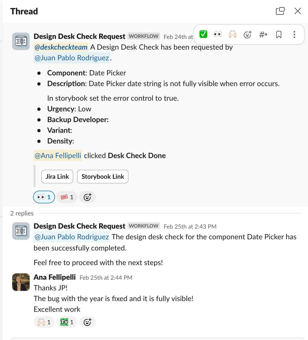
After approvals, we handed off to developers and maintained close communication, assisting with component creation and QA. We implemented a Slack workflow, 'DeskCheck Request,' for developers to specify the review focus (e.g., alignment, colors, behavior). Upon review completion, we clicked “DeskCheck Done” and added comments for required changes on the linked Jira ticket and Slack thread. This streamlined our process efficiently.
Another part of the implementation was uploading the new documentation to the WEAVE website (which is private at the moment). Previously, we added it by code, cloning the repository to our computer through GitHub and uploading the content to the respective page. For this project, we transitioned to Supernova.io. After uploading everything to the website, a content designer reviewed and approved it.
results
We successfully implemented the MUI Data Grid into our design system, created full and detailed documentation of every feature both in Figma and on the website, and developed functional data grid components in Figma and Storybook for product teams to work with and design.