INDUSTRY:
TECH & DESIGN
CLIENT:
AUTODESK
YEAR:
2022
EXPERIENCE:
UX DESIGN
Skeleton Loader
Skeleton Loader
Skeleton Loader
about.
about.
Autodesk, Inc. is a globally renowned leader in software solutions for the architecture, engineering, construction, manufacturing, media, and entertainment industries. Weave is Autodesk's design system, providing a framework of reusable components, guidelines, and best practices to ensure consistency and efficiency across all Autodesk products.
Challenge
Create the Skeleton Loader component and guidelines for our design system.
Goal
Develop a cohesive Skeleton Loader component and detailed guidelines for the Weave design system, ensuring consistent implementation and user experience across Autodesk products.
My Role
I was the Product Designer responsible for this component, under the guidance of the Lead Designer.
I was the Product Designer responsible for this component, under the guidance of the Lead Designer.
My Responsabilities
I worked on the discovery process, research, sketches, prototypes, guidelines creation, developer assistance, QA, and documentation updates.

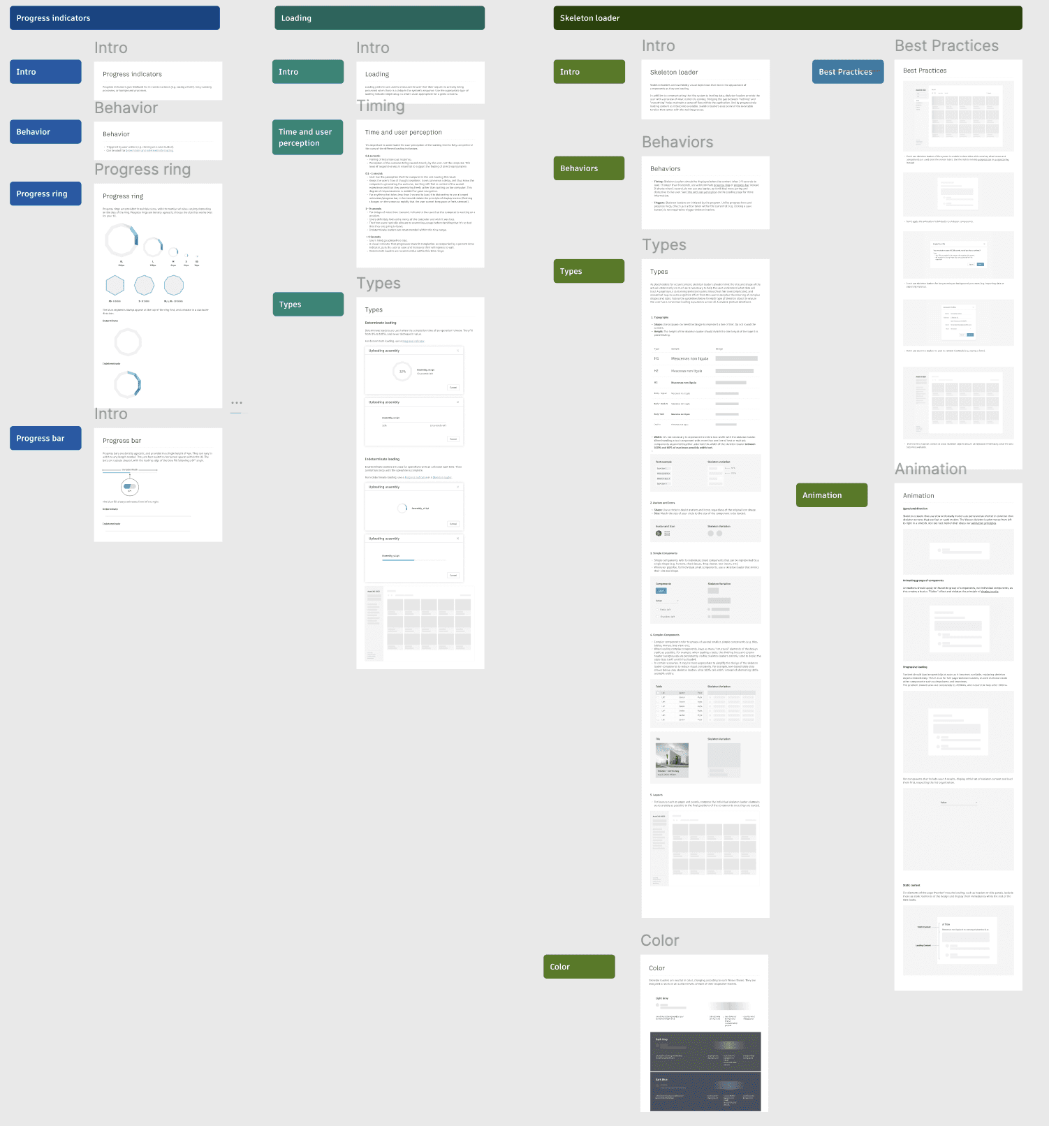
design process.
The design process to create a new component follows: research, sketches, design, documentation, and implementation.
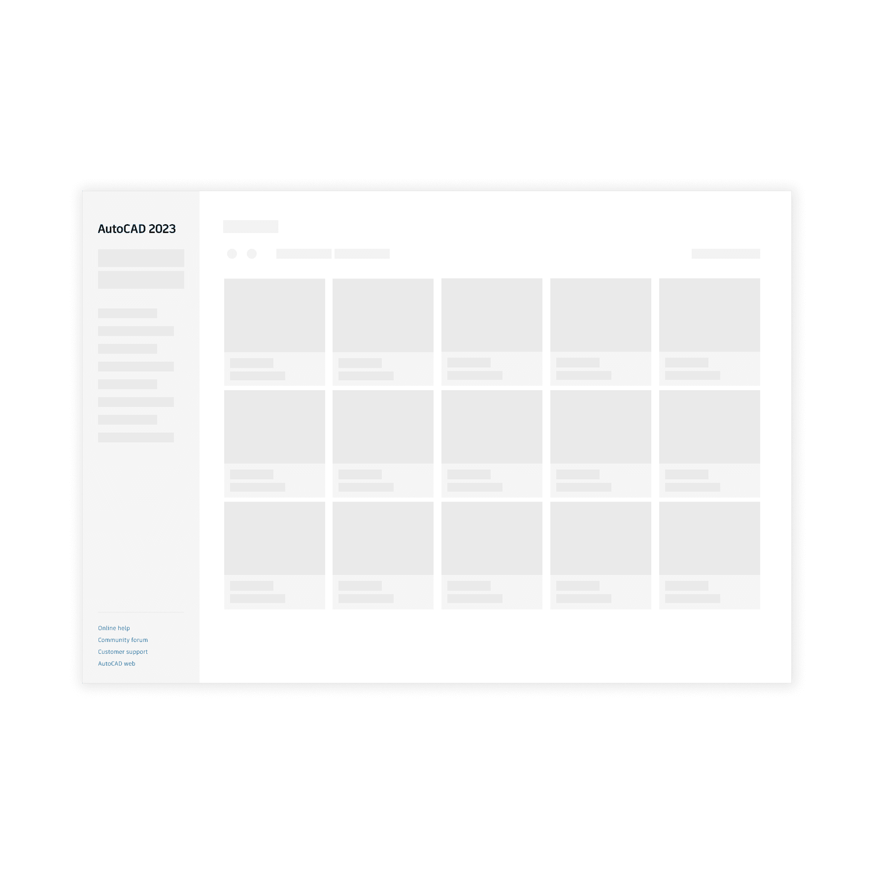
research
The research phase involved conceptual research about loading, time, and user perception, as well as the different types and uses of loaders. Additionally, I conducted an internal audit to discover how Autodesk products use loaders and if there were any existing use cases of a Skeleton Loader, which there were. External research was also conducted to understand both the behaviors of different loaders and the design of the skeleton loader. In this research, I discovered users' perception during waiting times and how it changes. The goals for loaders were identified: provide appropriate feedback, reduce user uncertainty, make users feel like they are directly causing something to happen on the screen, differentiate user actions from system loading. This helped determine the appropriate scenarios for each type of loader and behavior.
Time and user perception
It's important to understand the user perception of the waiting time to fully comprehend the uses of the different loading indicators.
0.1 seconds:
Feeling of instantaneous response.
Perception of the outcome being caused directly by the user, not the computer. This level of responsiveness is essential to support the feeling of direct manipulation.
0.1 - 1 second:
User has the perception that the computer is the one causing the result.
Keeps the user's flow of thought seamless. Users can sense a delay, and thus know the computer is generating the outcome, but they still feel in control of the overall experience and that they are moving freely rather than waiting on the computer. This degree of responsiveness is needed for good navigation.
For anything that takes less than 1 second to load, it is distracting to use a looped animation/progress bar, in fact would violate the principle of display inertia (flashing changes on the screen so rapidly that the user cannot keep pace or feels stressed).Time and user perception
It's important to understand the user perception of the waiting time to fully comprehend the uses of the different loading indicators.
1 - 9 seconds:
For delays of more than 1 second, indicate to the user that the computer is working on a problem.
Users definitely feel at the mercy of the computer and wish it was fast.
The time users typically allocate to examining a page before deciding that it's so bad that they are going to leave.
Indeterminate loaders are recommended within this time range.
> 9 Seconds:
Users mind go somewhere else.
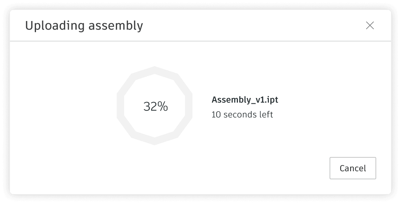
A visual indicator that progresses towards completion, accompanied by a percent done indicator, puts the user at ease and increases their willingness to wait.
Determinate loaders are recommended within this time range.Types of loading
Determinate:
Determinate loaders are used when the completion time of an operation is know. They fill from 0% to 100%, and never decrease in value.
For determinate loading, use a Progress indicator.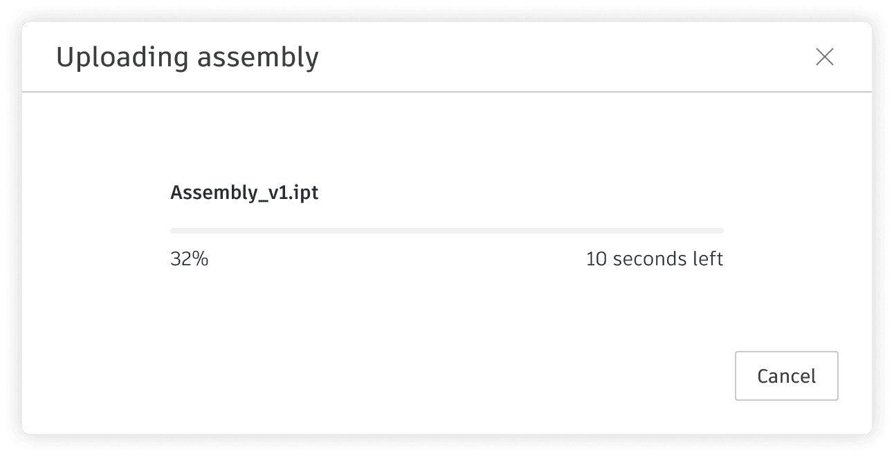
Types of loading
Indeterminate:
Indeterminate loaders are used for operations with an unknown wait time. Their animations loop until the operation is complete.
For indeterminate loading, use a Progress indicator or a Skeleton loader.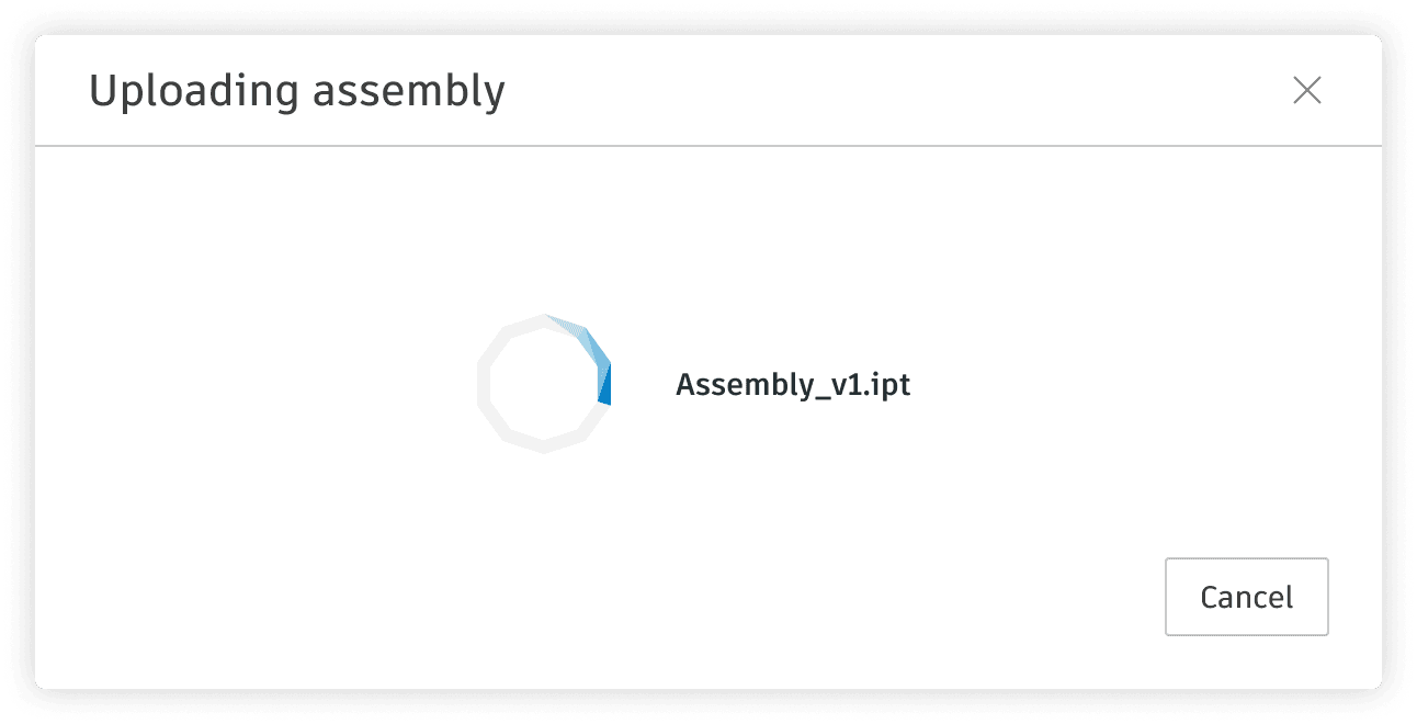
Time and user perception
It's important to understand the user perception of the waiting time to fully comprehend the uses of the different loading indicators.
0.1 seconds:
Feeling of instantaneous response.
Perception of the outcome being caused directly by the user, not the computer. This level of responsiveness is essential to support the feeling of direct manipulation.
0.1 - 1 second:
User has the perception that the computer is the one causing the result.
Keeps the user's flow of thought seamless. Users can sense a delay, and thus know the computer is generating the outcome, but they still feel in control of the overall experience and that they are moving freely rather than waiting on the computer. This degree of responsiveness is needed for good navigation.
For anything that takes less than 1 second to load, it is distracting to use a looped animation/progress bar, in fact would violate the principle of display inertia (flashing changes on the screen so rapidly that the user cannot keep pace or feels stressed).Time and user perception
It's important to understand the user perception of the waiting time to fully comprehend the uses of the different loading indicators.
1 - 9 seconds:
For delays of more than 1 second, indicate to the user that the computer is working on a problem.
Users definitely feel at the mercy of the computer and wish it was fast.
The time users typically allocate to examining a page before deciding that it's so bad that they are going to leave.
Indeterminate loaders are recommended within this time range.
> 9 Seconds:
Users mind go somewhere else.
A visual indicator that progresses towards completion, accompanied by a percent done indicator, puts the user at ease and increases their willingness to wait.
Determinate loaders are recommended within this time range.Types of loading
Determinate:
Determinate loaders are used when the completion time of an operation is know. They fill from 0% to 100%, and never decrease in value.
For determinate loading, use a Progress indicator.Types of loading
Indeterminate:
Indeterminate loaders are used for operations with an unknown wait time. Their animations loop until the operation is complete.
For indeterminate loading, use a Progress indicator or a Skeleton loader.Time and user perception
It's important to understand the user perception of the waiting time to fully comprehend the uses of the different loading indicators.
0.1 seconds:
Feeling of instantaneous response.
Perception of the outcome being caused directly by the user, not the computer. This level of responsiveness is essential to support the feeling of direct manipulation.
0.1 - 1 second:
User has the perception that the computer is the one causing the result.
Keeps the user's flow of thought seamless. Users can sense a delay, and thus know the computer is generating the outcome, but they still feel in control of the overall experience and that they are moving freely rather than waiting on the computer. This degree of responsiveness is needed for good navigation.
For anything that takes less than 1 second to load, it is distracting to use a looped animation/progress bar, in fact would violate the principle of display inertia (flashing changes on the screen so rapidly that the user cannot keep pace or feels stressed).Time and user perception
It's important to understand the user perception of the waiting time to fully comprehend the uses of the different loading indicators.
1 - 9 seconds:
For delays of more than 1 second, indicate to the user that the computer is working on a problem.
Users definitely feel at the mercy of the computer and wish it was fast.
The time users typically allocate to examining a page before deciding that it's so bad that they are going to leave.
Indeterminate loaders are recommended within this time range.
> 9 Seconds:
Users mind go somewhere else.
A visual indicator that progresses towards completion, accompanied by a percent done indicator, puts the user at ease and increases their willingness to wait.
Determinate loaders are recommended within this time range.Types of loading
Determinate:
Determinate loaders are used when the completion time of an operation is know. They fill from 0% to 100%, and never decrease in value.
For determinate loading, use a Progress indicator.Types of loading
Indeterminate:
Indeterminate loaders are used for operations with an unknown wait time. Their animations loop until the operation is complete.
For indeterminate loading, use a Progress indicator or a Skeleton loader.
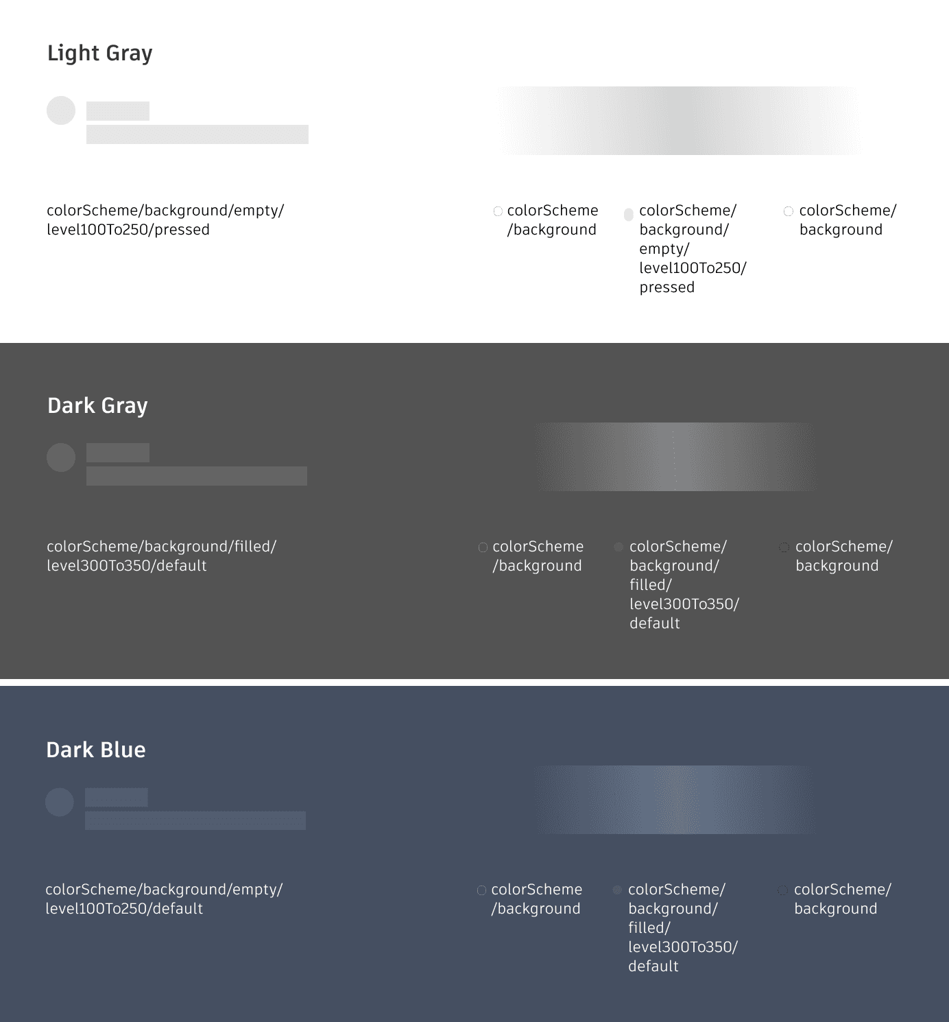
design
I divided the design into five categories: Text, Avatar and Icon, Simple components, Complex components, and Layouts. After designing the structure of the skeleton loader for these components, I worked on the animation, which features a gradient wave.
I divided the design into five categories: Text, Avatar and Icon, Simple components, Complex components, and Layouts. After designing the structure of the skeleton loader for these components, I worked on the animation, which features a gradient wave.
Types of Skeleton
Typography
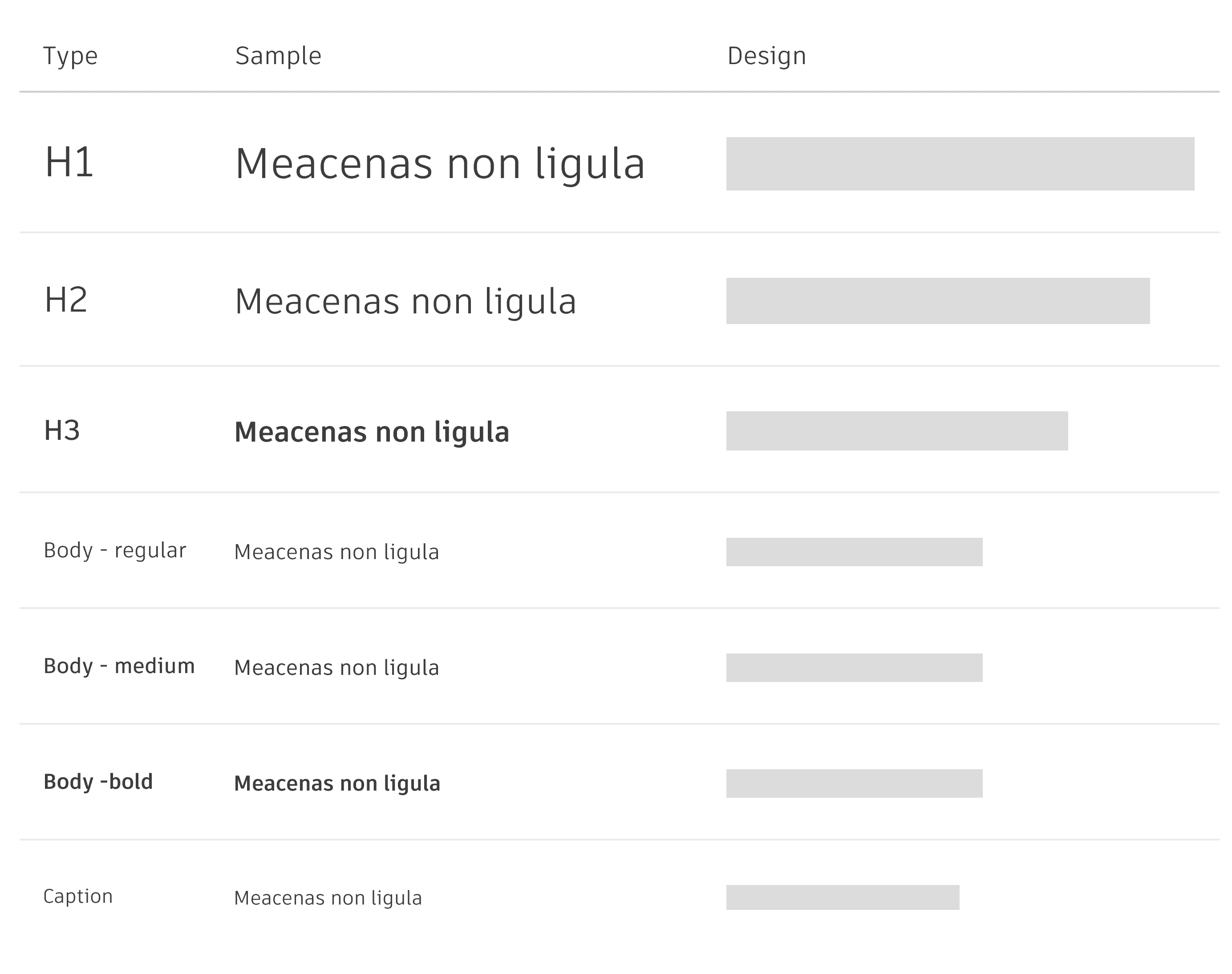
• Shape: Use a square-cornered rectangle to represent a line of text. Do not round the corners.
• Height: The height of the skeleton loader should match the line height of the type it is placeholding.
Types of Skeleton
Simple Components
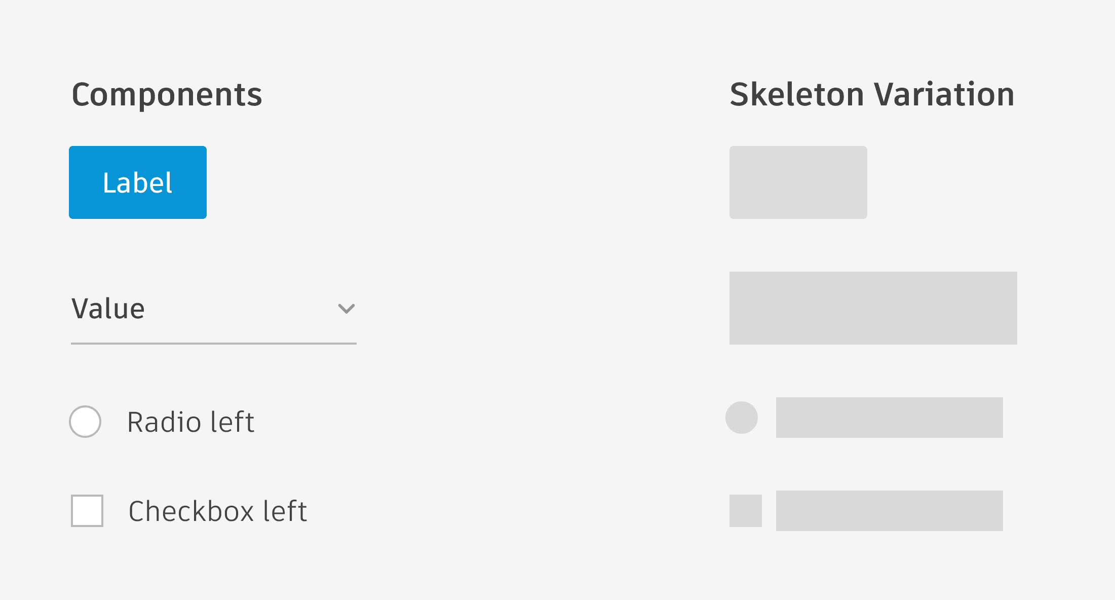
• Simple components refer to individual, small components that can be represented by a single shape (e.g. buttons, check boxes, drop-downs, text inputs, etc).
• Whenever possible, for individual small components, use a skeleton loader that mimics their size and shape.
Types of Skeleton
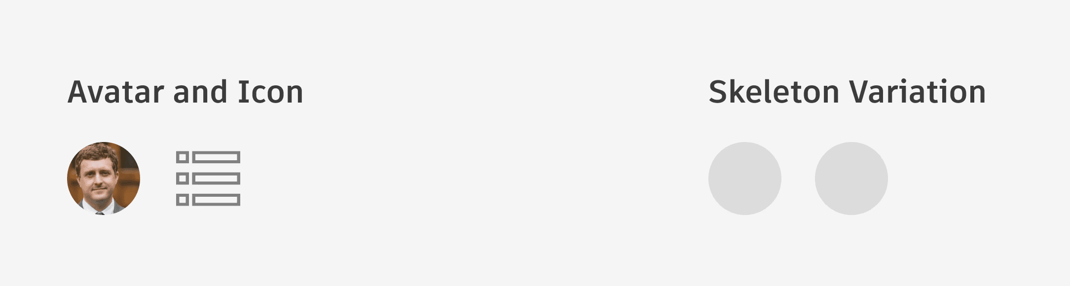
Avatars and Icons
• Shape: Use a circle to depict avatars and icons, regardless of the original icon shape.
• Size: Match the size of your circle to the size of the component to be loaded.
Types of Skeleton
Complex Components
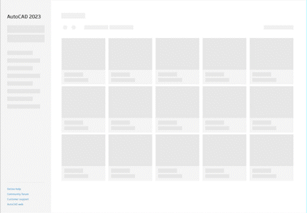
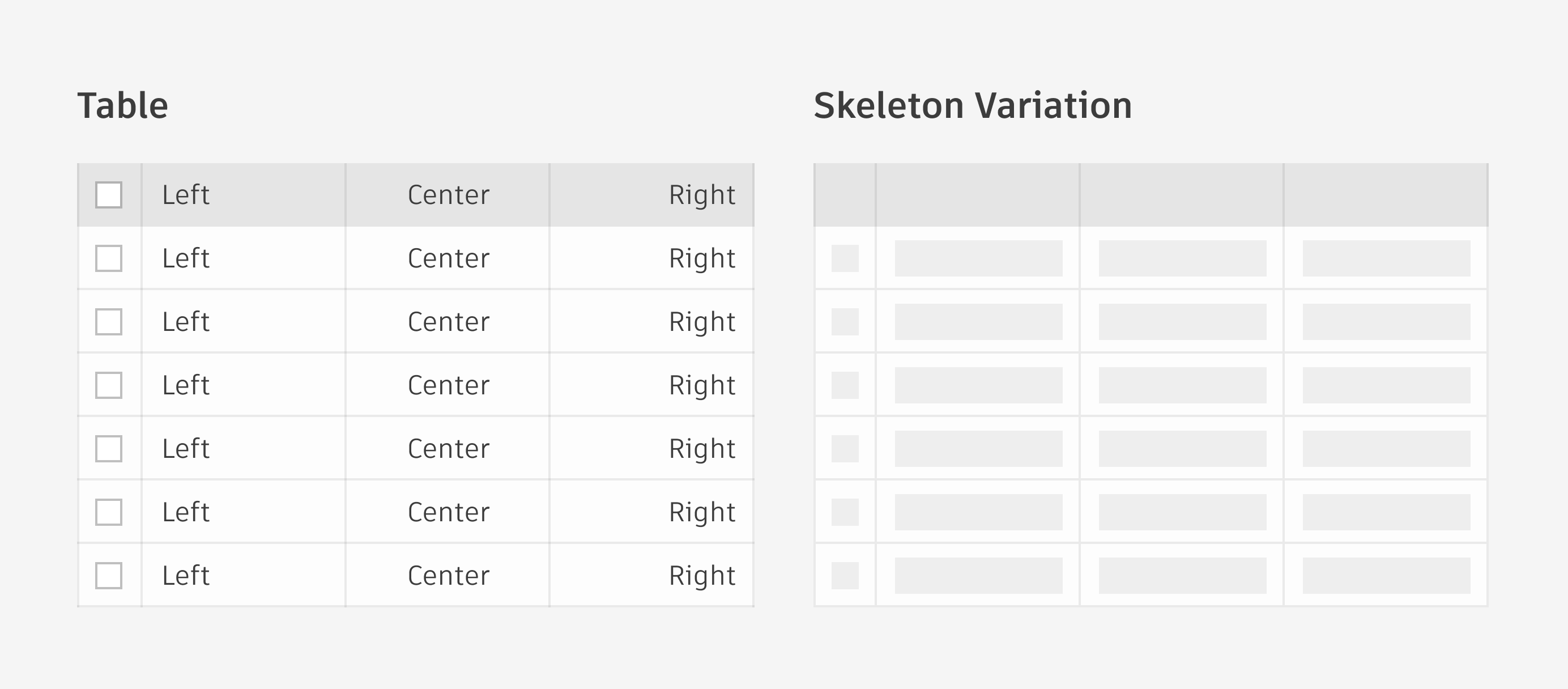
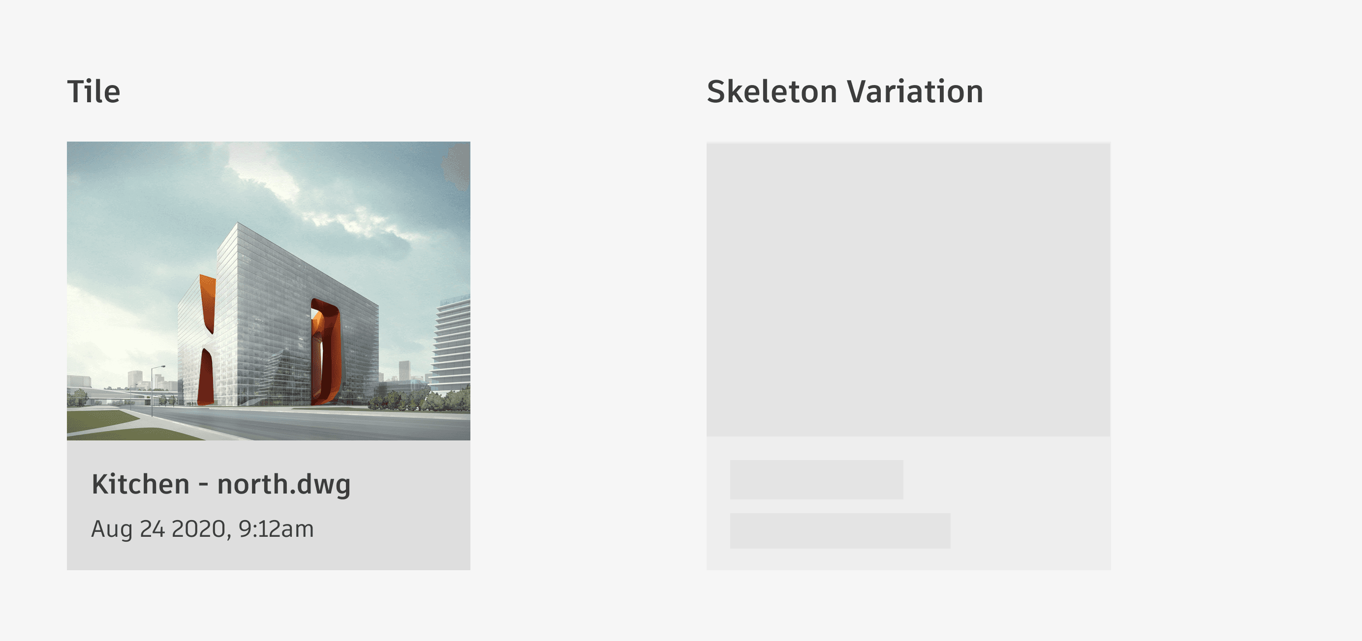
Complex components refer to groups of several smaller, simple components (e.g. tiles, tables, menus, tree view, etc).
When loading complex components, keep as many “structural” elements of the design static as possible. For example, when loading a table, the dividing lines and column header backgrounds are persistently visible; skeleton loaders are only used to depict the table data itself until it has loaded.
Types of Skeleton
Layouts
For layouts such as pages and panels, compose the individual skeleton loader elements as accurately as possible to the final positions of the components once they are loaded.
Types of Skeleton
Typography
• Shape: Use a square-cornered rectangle to represent a line of text. Do not round the corners.
• Height: The height of the skeleton loader should match the line height of the type it is placeholding.
Types of Skeleton
Simple Components
• Simple components refer to individual, small components that can be represented by a single shape (e.g. buttons, check boxes, drop-downs, text inputs, etc).
• Whenever possible, for individual small components, use a skeleton loader that mimics their size and shape.
Types of Skeleton
Avatars and Icons
• Shape: Use a circle to depict avatars and icons, regardless of the original icon shape.
• Size: Match the size of your circle to the size of the component to be loaded.
Types of Skeleton
Complex Components
Complex components refer to groups of several smaller, simple components (e.g. tiles, tables, menus, tree view, etc).
When loading complex components, keep as many “structural” elements of the design static as possible. For example, when loading a table, the dividing lines and column header backgrounds are persistently visible; skeleton loaders are only used to depict the table data itself until it has loaded.
Types of Skeleton
Layouts
For layouts such as pages and panels, compose the individual skeleton loader elements as accurately as possible to the final positions of the components once they are loaded.
documentation
While designing, I started working on the documentation. We added a page on the Weave website under the “Foundation” section of our design system and a new page in the component section for the skeleton loader. The documentation focused on expected behavior, the anatomy of each design component, colors, animation specs, and best practices. After the feedback was approved by the lead designer and content designer, everything was updated on the website.
While designing, I started working on the documentation. We added a page on the Weave website under the “Foundation” section of our design system and a new page in the component section for the skeleton loader. The documentation focused on expected behavior, the anatomy of each design component, colors, animation specs, and best practices. After the feedback was approved by the lead designer and content designer, everything was updated on the website.
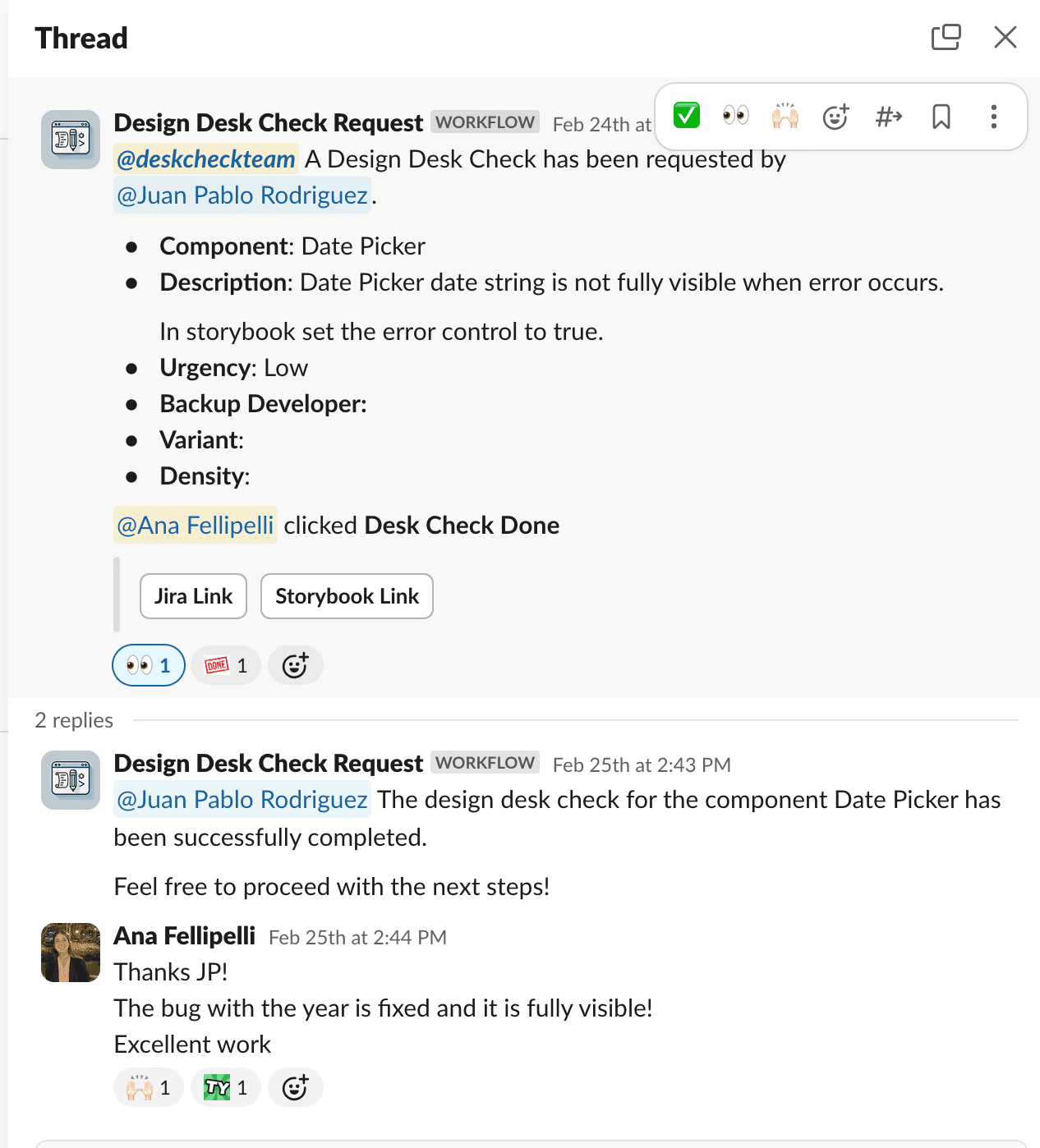
implementation
After approvals, we handed off to developers and maintained close communication, assisting with component creation and QA. We implemented a Slack workflow, 'DeskCheck Request,' for developers to specify the review focus (e.g., alignment, colors, behavior). Upon review completion, we clicked “DeskCheck Done” and added comments for required changes on the linked Jira ticket and Slack thread. This streamlined our process efficiently.
After approvals, we handed off to developers and maintained close communication, assisting with component creation and QA. We implemented a Slack workflow, 'DeskCheck Request,' for developers to specify the review focus (e.g., alignment, colors, behavior). Upon review completion, we clicked “DeskCheck Done” and added comments for required changes on the linked Jira ticket and Slack thread. This streamlined our process efficiently.
results.
We successfully delivered a functional component to our design system and multiple product teams, created full and detailed documentation of every feature both in Figma and on the website.